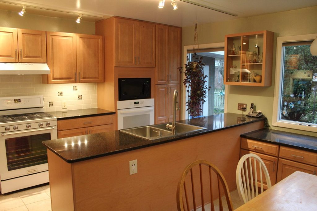

Beautiful kitchens come in all shapes and sizes, but one of the constants is a more open feeling. This kitchen felt claustrophobic with the center cabinets reaching to the ceiling. The dated look of the metal legs against the faded wood of the cabinets left a gloomy feeling. Our designer did a fantastic job of utilizing the existing space. Notice how clean and open the kitchen feels.
When compared to the before pictures below, the difference is astounding! The tile splash with medallions sprinkled throughout really add to the character of the space. The quartz tops shine nicely, and the lighting accents the cabinets. This client didn’t want to move walls or create drastic layout changes, so we kept the design as streamlined as possible. The result was a kitchen that our client loved, and a space that was much better suited to their lifestyle. Let A+ create a space that captures your imagination!


