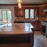
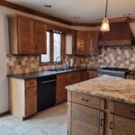
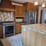
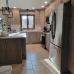
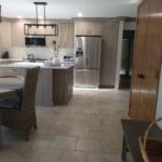
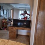
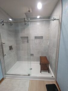
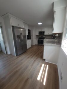
Welcome back! Last week we showed off a simple, yet stylish, tub renovation. This time around, we had the pleasure of renovating a kitchen for the same client! The existing kitchen was installed with the previous homeowner’s ideas in mind, and now it was time to bring it up to our client’s standards. Our client desired to keep the same flooring. With this in mind, we went to work on a design that had a similar foot print, but a whole new vibe. A definite must was a kitchen with a beverage center! Our designers worked with the client during the design and product selection process until the perfect result was achieved. Let’s take a look at what we started with:
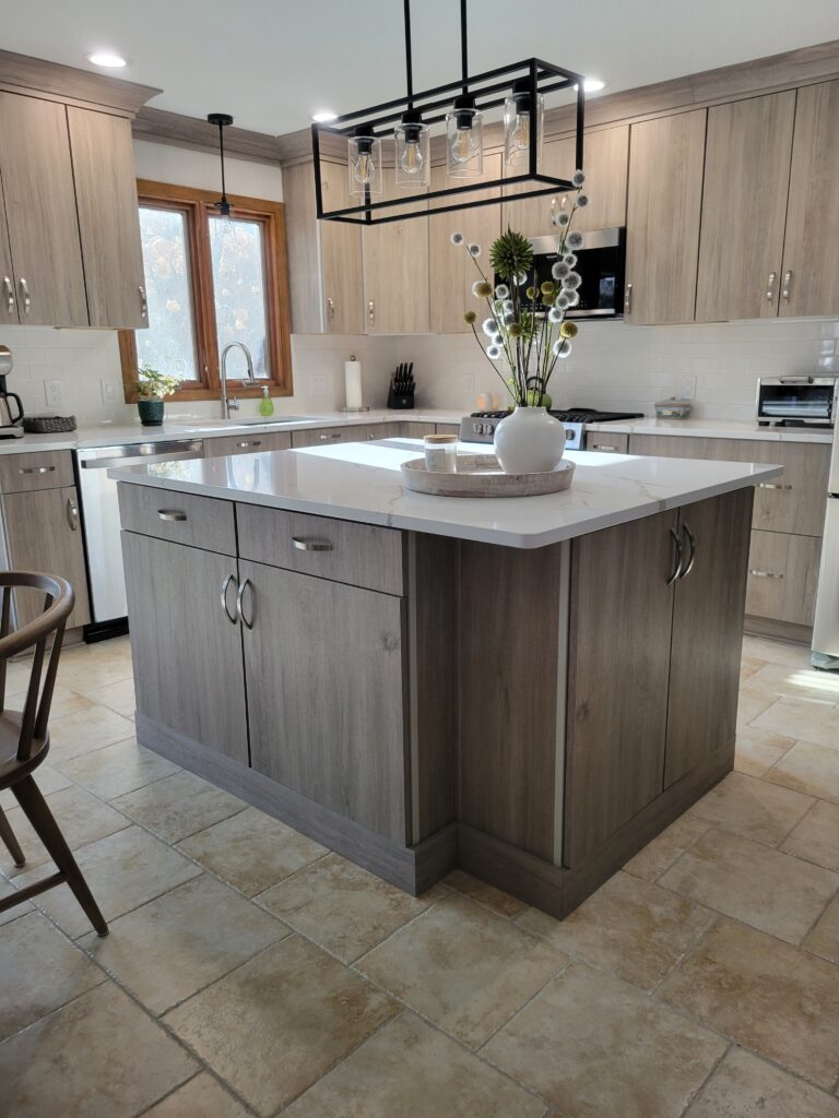
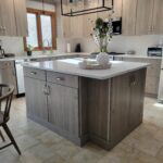
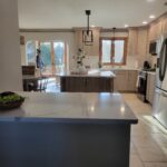
Nothing essentially wrong with the look, just not our homeowner’s taste. While the existing space looked normal from the outside, we were in for a surprise. Once we completed the demolition process, we found open junctions in the wall, along with other code violations. Projects of this size run into unknowns from time to time, so we informed the client and came up with a game plan to move forward. The results were spot on:
Perfect!
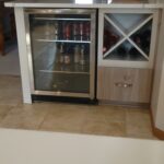
Totally new vibe to the kitchen space! Just like their bathroom renovation, our client desired a simple, yet elegant, transformation. Remember that kitchen with a beverage center we talked about? We turned the old desk area into the perfect spot:
Our clients loved the results, and we enjoyed pulling the new space together. Give A+ Home Improvements a call to see what we can do for you!!

